
Creating mosaic Transitions
- Susanna Mills

- Oct 31, 2020
- 2 min read
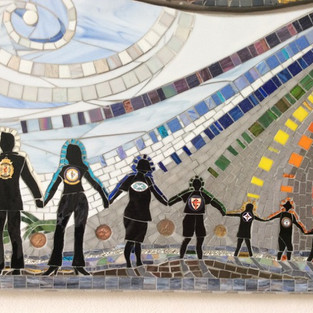
Transitions look magnificent as backgrounds in mosaic art. Think skies, oceans, landscapes, and abstracts. But the first thing one needs to understand regarding creating any mosaic transition, is the difference between tone and colour. (Art School, Lesson 1.01 !)
TONE in art, is defined as a hue or a shade of a colour, ranging from dark, to light.
COLOUR in art, is a phenomenon of light and the characteristic described through colour categories such as pink, orange or blue.
NOT A COLOUR? Technically black, white, and grey are not colours. But they are, however, very important in any design, as they are essential for expressing light and shade (aka Greyscale).
With this in mind, assembling mosaic transitions can be done in one of two ways:
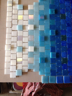
a) TRADITIONAL: Patterning
Patterning a transition is more suited to the traditional styles of Opus mosaicing. This involves working with the actual shapes of your mosaic material of choice, as well as the depths of tones available to you for the transition.
Next, you have to decide at what point you are going to mix your tones darker or lighter, and how this pattern will work visually to achieve a successful vignette of colour and tone.

b) CONTEMPORARY: Loose Mixing
Loose mixing is less exacting than patterning while looking very effective and just as visually appealing. It involves breaking and/or blending shapes, colours, tones and often adding a variant such as mirror glass. Many mosaic tile manufacturers sell blends of mosaic tiles for commercial applications for interior or exterior architecture. Blended mosaic tile sheets, if you can find them, do the colour and tonal curation for you.
Alternately, why not enjoy curating your own blend of mosaic tiles to create a transition that is uniquely yours within the next mosaic artwork you create?


Comments